Islam is the real positive change that you need to change for being a better person or a perfect human being, you can change yourself if you read QURAN, IF YOU DO THAT !! you will change this UMMAH, say I am not A Sunni or Shia, BUT I am just a MUSLIM. Be a walking QURAN among human-being AND GUIDE THEM TO THE RIGHT PATH.
دبي، الإمارات العربية المتحدة (CNN)
-- انشغل العديد من متابعي مواقع التواصل الاجتماعي بالحديث عن المقابلة
الأخيرة مساء السبت لمفتي مصر السابق، علي جمعة، والتي تحدث فيها عن نسب
الملكة إليزابيث، ملكة بريطانيا، قائلا إنها تنحدر من أسرة النبي محمد،
ولكن جدها اضطر لاعتناق المسيحية، الأمر الذي أثار الكثير من الجدل بين
المغردين.
موقف جمعة جاء في معرض حديثه عن الكثير من الآراء
الفقهية الموجودة لدى الجماعات الإسلامية، مشيرا إلى أنها آراء متشددة
لأنها خرجت في فترة كان فيها المسلمون تحت الاحتلال ويضطرون لترك دينهم
قائلا: "لم يكن هناك مسلم واحد قادر على البقاء في أوروبا في ذلك الزمن.
قبضوا في مرة من المرات على شخص من آل هاشم، فأرغموه على التنصر، وقبل إنه
هو جد الملكة، وكتبت كتب حول هذه القضية."
وتابع جمعة بالقول: "جد الملكة كان من آل هاشم، من
آل النبي يعني، فكيف لم تصبح الملكة (إليزابيث) مسلمة؟ لأن جدها ترك
الإسلام بسبب الضغط والقهر كما جرى مع المسلمين المورسكين في أسبانيا، كنا
نتعرض للضرب من الشرق والغرب والفقه الذي قيل في ذلك الوقت كان سببه هذا
الضرب."
وتباينت التعليقات على مواقع التواصل الاجتماعي على
ما أدلى به جمعة، وقال جزراوي مهاجر معقبا: "علي جمعة يقول ملكة بريطانيا
إليزابيث من آل البيت.. يعنى من بيت النبوة!..
الطموا يا مسلمين" أما الكاتب المتخصص في الحركات الإسلامية، ياسر
الزعاترة، فكتب قائلا: "لمن لم يستمتع بهذه التجليات مساء أمس: علي جمعة:
ملكة بريطانيا هاشمية من آل البيت."
وعلقت مغردة أخرى بسخرية قائلة: "شيماء من المحلة بتسأل فضيلة
الشيخ علي جمعة، هل يجوز زواج الفامبير من الإنسانة العادية كما حدث في
فيلم الشفق؟" بينما قال جمال عيد: "علي جمعة: جد ملكة بريطانيا من آل
البيت...!!
متى سنسمع : أنا عايز أختى اليزابيث؟" في حين علق إبراهيم
القحطاني مستذكرا مواقف سابقة لجمعة ضد الإخوان المسلمين بالقول: "علي
جمعة: ملكة بريطانيا من آل البيت. اضرب بالمليان :) "
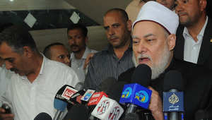
دبي، الإمارات العربية المتحدة (CNN)--
قال مُفتي مصر السابق الشيخ علي جمعة، في مقابلة تلفزيونية على قناة
فضائية مصرية، إن السجائر والحشيش والأفيون طاهر ولا يُبطل الوضوء، في حين
أن الخمر نجس ولكن لا يقتضي إعادة الوضوء وإنما فقط غسل الجزء من الجسد
الذي لامسه، على حد تعبيره.
ورأى جمعة أنه "لا علاقة للحرمة مع الوضوء"، مضيفا: "
طب واحد شرب بوء خمر، شامبانيا كده، يعمل إيه؟ الخمر حرام قطعا،
والشامبانيا حرام قطعا، ولكن هنا لازم يمضمض، طب هناك إيشمعنا؟ لأن
السيجارة طاهرة بس حرام، والحشيش طاهر بس حرام، والأفيون طاهر بس حرام."
وأقر جمعة أنه في حال صلى شخص "وفي جيبه حتة أفيونة
أو حتة حشيشة" فإن صلاته صحيحة. ولكن إذا كان "في جيبه إزازة خمرة؟ صلاته
باطلة، لأن الخمر نجس.. طب وفي جيبه باكيت دخان، صلاته صحيحة، لأنها طاهرة
عاملة زي الحشيش والأفيون.. الحرمة حاجة والطهارة حاجة تانية."
وأكد أنه إذا دخل الخمر الفم فيجب المضمضة قبل الصلاة، وإذا
لامست اليد الخمر يجب غسلها ولكن دون حاجة لإعادة الوضوء. لأن المرء عندئذ
يزيل "آثار النجاسة من الجسد ظاهرا وباطنا." وأقر أن "ملامسة النجاسة لا
تنقض الوضوء، وإنما يجب معها إزالة النجاسة."
Yet another oppressed white guy lost his job because of a black
man — or, at least, that’s what now-former MMC Land Management
employee Joe Pisone will likely be telling his buddies in his local
Klavern for years to come. After getting off work, the Pennsylvania
resident should have gone home to have a beer or six. Instead, he
decided to stop by and harass some anti-fracking activists.
“Have you actually done something with your life, have you had any
kind of a job?” he asks one of the activists, who laughs at him. If
you’re thinking Joe is a terrible person already, you’re right — but it
gets much worse:
“Just like this chimp right here.”
Outraged, one of the activists responds, “What did you say?” Not
satisfied to simply repeat his horrible remark, Joe decided to expound
on how he felt about “one of the ten” black people he says he has seen
in his lifetime:
“Yeah, chimp. A f*cking n*gger right here with a mop on his head. I don’t give a f*ck. He’s milking my f*cking tax dollars.”
“We’re peaceful, we do not need your antagonism,” one of the
protesters tells Mr. Pisone, who responded by making chimp noises in
front of the camera. “F*cking lazy monkeys,” he says. Chimps, of course,
are apes, not monkeys. Joe would know this if he had above a grade
school education.
According to Joe, the activists — who were fighting for a cause they believe in their spare time — were jobless, but he was simply there to “tease” them because his job was rained out that day.
“I was photographing a peaceful protest aimed at Rex Energy in Mars,
Pa, At one point during the day a worker showed up. He started by
insulting the protesters. Then he turned his attention to me,”
photojournalist Tom Jefferson said of the verbal assault. “I just let
him talk and kept the camera rolling.”
As awful as he is, it’s probably good that he had fun — because it’s
probably the last bit of enjoyment he will have for quite some time.
According to MMC, he was terminated after they became aware of the footage. In a statement posted to Facebook, the company said:
“Today, we were disgusted to learn that one of MMC’s
former employees used racial slurs and made racially charged comments
during a peaceful protest in Mars, Pennsylvania, outside of work hours
at a location with which we have no affiliation. We are sorry that this
incident occurred. Whether at work or not, we do not condone hate speech
– EVER. Inclusion and diversity are among MMC’s core values. We believe
in equality for everyone, regardless of race, age, gender identity,
ethnicity, religion or sexual orientation. MMC has terminated this
employee and will never do business with him again in the future.”
So…who’s unemployed now, Joe?
The job hunt sure will be interesting when this video is the top of Google search results. Watch the disgusting rant below:
NewsRescue
The “Kaduna State Council of Imams and Ulama” visited the Kaduna State
Governor Elrufai and declared support for the recent brutal killings of
hundreds if not thousand plus defenseless Muslims in Zaria by the
Nigerian Army. The Council is made up of Sunni & Wahhabi Mosque
Imams.
This is a sectarian agenda that is poisonous to the quest of well
meaning Muslim scholars for Unity among Muslims. Due the need of unity,
millions of members of the Islamic Movement of Nigeria under the
leadership of His Eminence Sheikh Ibrahim Zakzaky refused to build
separate mosques. Sheikh Zakzaky ordered all his followers to pray in
the existing Sunni-Dominated mosques despite the massive anti-Shia
propaganda taking place in most of these mosques.
A mosques is suppose to be a place where Unity of Muslims is promoted
& propagated, the mosque Imams are supposed to be the embodiments of
Muslim Unity. It is quite unfortunate & must be condemned when
mosque Imams becoming willing tools of the corrupt Northern elites who
today form the notorious genocidal military-civilian cabal that is today
executing foreign-sponsored evil foreign-sponsored agenda against the
peaceful IMN & it’s leadership.
Today one of the greatest challenges facing world Muslims is terrorism.
Muslims youths inspired by the deviant cult of Wahhabism become
bloodthirsty monsters that only kill the innocent & destroy towns
& cities all in the name of Islam. This is what should occupy the
minds, programs and activities of these mosque Imams, & not
promoting the poison of sectarianism that will only harm Muslims from
within.
These mosque Imams should have asked why did Nigerian Muslims youths
ended up becoming members of #BokoHaram, & they are so brutal that
last year they won the ignoble award as the most deadliest terrorist
group in the world eclipsing the more popular ISIS.
The season we are today is the season of the birth anniversary of the
seal of all Messengers & Prophets of God, Muhammad al-Mustapha (sa),
this should be a period to promote Unity among Muslims & not
further divisions.
The principal actors of the Zaria massacre in Nigeria wish to cover
their heinous Atrocities, so they induced these mosque Imams to show
support for their brutal killings of defenseless Nigerians in Zaria. But
it is important that people fear God & fear the Day they will meet
Him & He will preside over all affairs.
If some of these mosque Imams are angry that their school of thought is
losing millions of followers to another school of thought in Nigeria,
the answer to this is not to show support for what is increasingly known
as a pre-planned genocide. They should ask themselves why is our school
of thought becoming less attractive to Nigerian Muslims? And the answer
they will find is that Wahhabism has contaminated Sunni Islam in
Nigeria to the extend the highest values of love, mercy & compassion
that Islam preaches is being eclipsed by the hate, compound ignorance
& terrorism that are the cardinal manifestations of Wahhabism.
On a final note, Muslim scholars & mosque Imams should work for
Unity & oneness of Muslims & not dance to the flute of
sectarianism that is a potent poison. They should also concentrate on
finding lasting solutions to the problem of Muslim youths been attracted
to terrorism. They should create attractive & positive programs
& activities that will attract Muslim youths away from terrorism
& extremist influence.
For the past 37 years the IMN & it’s charismatic Leader have always
preach peace and peaceful coexistence. The IMN & it’s members have
never partake in any inter-religious & intra-religious since it’s
inception. The IMN should not be a target for this mosques Imams, the
IMN should be their partner for Muslim Unity & for the progress
& development of our great country Nigeria.
decades of documented evidence reveal that the Saudis are the
primary conduit through which Western cash, weapons, support, and
directives flow into mercenary armies of extremists, indoctrinated by
Saudi Wahhabism – a politically-motivated perversion of Islam.
Saudi
Arabia’s Crown Prince Salman bin Abdulaziz Al Saud, 2nd right first
row, poses with Shura members at consultative Shura Council in Riyadh,
Saudi Arabia.
A recently announced Saudi-led
“anti-terror” coalition was met with great skepticism recently. This is
not because of doubts over Saudi Arabia’s sincerity alone, but because
of the fact that much of the terrorism the “coalition” is allegedly to
fight is an intentional creation of Saudi Arabian foreign policy to
begin with.
Calling Islamic extremism a disease,
Saudi Arabia has announced the formation of a coalition of 34 largely
Muslim nations to fight terrorism.
“This announcement comes from the
Islamic world’s vigilance in fighting this disease so it can be a
partner, as a group of countries, in the fight against this disease,”
Saudi Deputy Crown Prince and Defense Minister Mohammed bin Salman said.
Asked whether the new coalition
could include ground forces, Saudi Arabia’s top diplomat told reporters
in Paris on Tuesday that “nothing is off the table.”
In reality, decades of
documented evidence reveal that the Saudis are the primary conduit
through which Western cash, weapons, support, and directives flow into
mercenary armies of extremists, indoctrinated by Saudi Wahhabism – a
politically-motivated perversion of Islam – and sent to execute joint
Western-Saudi geopolitical ambitions in the Middle East and North
Africa (MENA) region and beyond.
In fact, over the decades, one can see a direct relation to the
increasing impotence of Western conventional forces and their ability to
project power across the planet, and the rise of unconventional
terrorist forces that reach into otherwise inaccessible regions in their
stead.
This does more than the West’s feigned ignorance and surprise to
explain why, after a year of allegedly battling the so-called “Islamic
State” (ISIS, ISIL, or Daesh) in Syria, the United States made little
progress and only after Russia’s recent intervention, has the terrorist
organization’s existence been put in jeopardy.
The rise of ISIS, turns out to be the premeditated machinations of the West and its regional partners. A Department of Intelligence Agency (DIA) report drafted in 2012 (.pdf) admitted:
If the situation unravels there is
the possibility of establishing a declared or undeclared Salafist
principality in eastern Syria (Hasaka and Der Zor), and this is exactly
what the supporting powers to the opposition want, in order to isolate
the Syrian regime, which is considered the strategic depth of the Shia
expansion (Iraq and Iran).
To clarify just who these “supporting powers” were that sought the
creation of a “Salafist” (Islamic) principality” (State), the DIA report
explains:
The West, Gulf countries, and Turkey support the opposition; while Russia, China, and Iran support the regime.
The DIA report makes it clear that Saudi Arabia’s “coalition” is the
source of all terrorism, not the solution, and that there already exists
a coalition sincerely committed to exterminating the scourge of
militant extremism in the MENA region – Russia, China, Iran, and of
course Syria itself.
A Facade to Hide Continued Terrorism Behind
Likely what Saudi Arabia is doing, is attempting to reboot a
narrative that, as of late, is increasingly implicating it and many of
the members of its “coalition” as the very source of global terrorism.
Additionally, Saudi Arabia has become increasingly involved directly
with military operations beyond its borders. Its forces are fighting in
neighboring Yemen, and military forces from Saudi Arabia and its Persian
Gulf neighbors have been fighting covertly and semi-covertly in
operations stretching from Libya to Syria.
Creating a “coalition” to fight “terrorism,” would give the Saudis
another rhetorical ploy to hide their increasingly direct role in
supporting militarily the terrorist proxies they have deployed and who
are now being defeated across the MENA region. Just as the US has done
in Syria, using ISIS as a pretext to involve itself directly and
militarily in the Syrian conflict without ever actually fighting ISIS,
Saudi Arabia is seeking to create a plausible cover story to do the
same.
For those interested in truly defeating terrorism globally –
recognizing the state sponsors of terrorism and excluding them
categorically from solving the problem until they are held responsible
for creating it in the first place is essential. Saudi Arabia’s
announcement was met with skepticism, even ridicule for this very
reason. Second, to defeat terrorism globally, those truly interested in
investing in such a battle, should do so with those demonstrating a
sincere desire to eradicate this scourge.
Thanks to the US DIA, a list of nations leading the fight has already been provided.
When people speak of Africa, they all too often refer to it as
one heterogeneous block, as opposed to a vast continent containing more
than 50 diverse countries. Even Joe Biden – Vice-President of the United
States and once chairman of the Senate Foreign Relations Committee –
has been guilty of such misconceptions, referring to “the nation of
Africa” when he spoke at last year’s US Africa Summit.
That’s not the only misunderstanding: for most of us, our image of
Africa is shaped by what we see on maps. And that image is completely
inaccurate.
It’s not really the fault of the cartographers. Any attempt to reflect a sphere on a flat surface will lead to distortions. And as Nick Stockton of Wired explains,
the goal of the flat-surface Mercator projection (on which most of the
maps we’re used to seeing are based) was not to provide an accurate
reflection of the world, it was to help sailors navigate the globe.
Referring to the maps creator, Gerardus Mercator, Stockton says: “Though
maps before and after have been better at showing us the whole earth,
Mercator’s was the first that gave us a means for exploring it. Mercator
never meant for his map to teach geography.”
But all too often, that’s exactly what it is used for. And that’s
what leads some people to believe Africa is really the size of
Greenland. It was to debunk this idea that Kai Krause, a graphical user
interface designer, decided to create this map to show just how enormous
Africa really is.
As with all maps, this one also has its flaws. “Krause seems to have
used the shapes of the countries from a Mercator projection, but has
scaled up the outline of Africa, without changing its shape, to show the
appropriate area,” points out the Economist.
But for Krause, this type of observation misses the point. As he explains on his website: “This
was not at all an attempt to create an accurate map.” It was instead
his way of showing just how much the rest of the world underestimates
Africa – not just in size but in many other aspects. Krause hopes his
work will play a small role in changing perceptions about the continent:
“Here is to Africa achieving the stature that it deserves to have,” his
explanation concludes. Have you read? 9 trends shaping the future of Africa 2 maps that will change how you see global population
5 maps on the state of world inequality Author: Stéphanie Thomson is an editor at the World Economic Forum Image: A man is photographed on a square decorated with a giant world map. REUTERS/Rafael Marchante
Posted by Stéphanie Thomson -
All opinions expressed are those of the author. The World
Economic Forum Blog is an independent and neutral platform dedicated to
generating debate around the key topics that shape global, regional and
industry agendas.
The Islamic State terrorist group has attempted to codify the
sexual relations between its fighters and women they capture, by issuing
a special ruling on when it’s OK to rape a female slave.
A "fatwa," which
is what a learned interpretation of the Islamic law is called, was
released by Islamic State (IS, formerly ISIS/ISIL) in late January as “some
of the brothers have committed violation in the matter of treatment of
the female slaves. These violations are not permitted by Sharia law
because these rules have not been dealt with in ages.” “Are there any warnings pertaining to this matter?” the authors of the document wondered.
The
ruling, which was among a batch of terrorist papers obtained by the US
Special Operations Forces during a raid in Syria in May, was viewed by
Reuters.
In the fatwa, the enslaved women and children of the infidels have been called “one of the graces which Allah have bestowed” upon the Islamic State.
According
to the UN, the jihadists have abducted thousands of women and girls as
young as 12 years old, selling them as sex slaves or giving to own
militants as rewards.
The IS theologians from the Committee of
Research and Fatwas have come up with over a dozen rules, which the
fighters are to follow in order to make their sexual practices comply
with the group’s laws. READ MORE: ISIS sets up ‘spoils of war’ dept to handle slaves, stolen treasure
The fatwa forbids the owners of female slaves to have intercourse with the woman during menstrual cycle.
Sexual contact with a pregnant captive carrying a child is also forbidden, with the document stressing that “it’s not permissible to cause her to abort if she’s pregnant.” “If
the owner of a female captive, who has a daughter suitable for
intercourse, has sexual relations with the latter, he is not permitted
to have intercourse with her mother and she is permanently off limits to
him,” the paper said.
According to the ruling, a fighter who owns two sisters, could only have intercourse with one of them.
The
father is restricted from engaging in sexual relations with a slave
owned by his son and vice versa, the fatwa No. 64, dated January 29,
2015, said.
Joint owners of a female captive are both banned from intercourse with her as she is viewed as "part of a joint ownership."
The slave owners were also instructed to “show
compassion towards her (female captive), be kind to her, not humiliate
her, and not assign her work she is unable to perform."
The women shouldn’t be sold to individuals about whom it’s known that they’ll mistreat the female slave, the fatwa concluded.
The document was among a number of bizarre rulings by Islamic State, which recently became available to the press.
One of the fatwas, for example, justified harvesting organs from infidels in order to save the life a Muslim. "The apostate's life and organs don't have to be respected and may be taken with impunity," it said. https://www.rt.com/news/327387-isis-rape-sex-slavery-law/
When Jessica Ruiz was rejected from beauty school, it was
because the schools believed her dream of becoming a makeup artist was
impossible. She disagreed and put her money where her mouth is.
Literally.
The 26-year-old
Philadelphia native has limited use of her arms and hands, but has
created her own techniques to work around it. When she does makeup, she bites down on a brush,
leans in close to her client, and applies everything from eyeliner to
lip gloss by moving her head. Her lines are precise, colors are even,
and technique is masterful.
Born with arthrogryposis, Ruiz is
unable to lift her arms and the bones in her hands are fused. The
disease is also in her legs, impacting the way she walks.
However, Ruiz does not let her disability be the most remarkable thing about her. “She was amazing from day one,” her grandmother told the Philadelphia Daily News.
But Ruiz’s interest in makeup was not a lifelong one. “I was a tomboy,” she told RT’s sister video agency, Ruptly.“I was mud pies and Tonka trucks; a typical little boy!” Her discovery of makeup came during a more difficult time in her life.
Between the hormones and angst, middle school is a difficult time for many people. However, Ruiz’s was especially so.
“I was being picked on by a group of girls,” she explained to Ruptly. “So I needed a way to literally bring positivity to myself.”
Ruiz
sought out ways to bring positivity to herself and found inspiration in
her aunt. She explained to the Philadelphia Daily Mail that she "watched
my aunt do makeup constantly, and I loved the way that it went from
plain Jane to va va voom. And I was like, 'That's what I want. I want to
be va va voom.' So I started wearing eyeliner.”
She
started small with eyeliner and mascara that she applied by holding the
makeup in her hand and moving her head. From there, she grew and
developed her skills. By 16, she was showing up to school with a full
face of makeup.
Her talent did not go unnoticed. Classmates began
to hire her for graduation photos and Ruiz began to believe that her
passion could become her career. She finished high school and applied to
beauty schools. However, she was rejected because the schools failed to
understand her condition.
After a period of depression, Ruiz was
able to pick herself back up thanks to the help of Philadelphia’s Jaleel
King, a disabled photographer. Since then, she has continued to work in
makeup. While people are initially “standoffish,” Ruiz is willing to explain her story to clients until they give her a chance.
Jessica’s next goal is to become a small business owner. She seeks to open her own business called Glam Bar in Philadelphia.
https://www.rt.com/usa/327046-hands-free-makeup-artist-disability/
An
Oregon woman who killed one woman and injured at least 35 pedestrians
when she plowed her car into crowds on a Las Vegas Strip sidewalk on
Sunday evening was driving with her license suspended, authorities said
on Monday.Lakeisha
N. Holloway, 24, who was homeless and living in her sedan with her
toddler, gave herself up to officers a short distance from the scene of
the carnage. She parked her car and told a valet to call 911, Las Vegas
Metropolitan Police Sheriff Joe Lombardo told a news conference.
Surveillance
video from the scene supports the police assertion that Holloway drove
into pedestrians as "an intentional act," Lombardo said.
He
told reporters Holloway made a statement to police explaining her
motive. He declined to relate what she said, other than that the
incident did not appear to be a militant attack.
According
to an arrest report posted online, Holloway told detectives she had a
stressful time on Sunday, trying to rest and sleep inside her vehicle,
but that she was told to move by security guards at the properties where
she stopped.
"Her license was
suspended by the Oregon DMV in 2012 and was also suspended by
(Portland's) Multnomah County in 2013 and has not been reinstated," said
Oregon Department of Transportation spokeswoman Sally Ridenour.
U.S.
law enforcement has been on heightened alert since 14 people died in a
Dec. 2 shooting massacre in San Bernardino, California, by a married
couple inspired by Islamic extremists.
Sunday's incident occurred during the Miss Universe beauty pageant at a nearby hotel.
Holloway
repeatedly drove her 1996 Oldsmobile into pedestrians on the crowded
walkway, banging into newspaper stands and poles, Lombardo said.
Bystanders pounded on the car window and tried to open the door in a futile attempt to stop her, he said.
Justin
Cochrane, a tourist having dinner on The Strip, told CNN the sedan, its
windshield cracked, barreled past him. He said the driver then swerved
to avoid a truck before accelerating back onto the sidewalk.
"It
was mayhem, and it was very intentional," Cochrane told CNN. "People
were flying. This child I saw, literally, hit. And the sound, I'll never
forget."
Jessica Valenzuela, 32,
of Buckeye, Arizona, died from injuries after she was struck, the Clark
County Coroner-Medical Examiner's office said.
Other victims included visitors from Colorado, Florida, Mexico and Quebec, Canada.
Clark County
District Attorney Steven Wolfson said his office planned to bring
charges of murder with use of a deadly weapon and other counts against
Holloway, who was held without bail.
POOR DRIVING RECORD
Holloway,
who is from Oregon and whose car was registered in Portland, had been
living in the car in Las Vegas for about a week with her 3-year-old
daughter, Lombardo said. The child was in the car when Holloway drove
into the pedestrians.
University
Medical Center was treating three patients listed as critical and two in
serious condition, spokeswoman Danita Cohen said. An 11-year-old was
among the injured, she said.
Holloway's child, who was unhurt in the incident, is in protective custody, Lombardo said.
In
the spring of 2012, Holloway received an award from a Portland
career-mentoring nonprofit for being a role model for high school
students, according to The Skanner, a community website in the Pacific
Northwest.
The story recounts
Holloway describing her mother as having "turned to alcohol, leaving
Lakeisha to fend for herself." Holloway was homeless during her
freshman year in high school, according to The Skanner, but had since
graduated.
On her Facebook page, Holloway indicated she had studied at Portland Community College.
The
Oregon DOT's Ridenour noted that generally drivers cannot obtain a
license in another state if their license has been suspended. That is
because licensing departments across the country share information, as
do law enforcement agencies.
In
Oregon, where a driver can have multiple suspensions at one time,
Holloway was cited and convicted in 2011 for driving uninsured and
operating a vehicle without a license.
Then,
in 2012, three months after being issued her first driver's license,
her license was suspended for failing to comply with insurance
requirements. It was suspended again in 2013 for failing to pay court
fines related to previous citations.
(Additional reporting by Alicia Avila, David Becker and Rollo Ross in Las Vegas, Curtis Skinner in San Francisco, Alex Dobuzinskis in Los Angeles, Ian Simpson in Washington, and Eric M. Johnson in Seattle; Writing by Alex Dobuzinskis and Eric M. Johnson; Editing by Dan Grebler and Richard Borsuk)
Lakeisha Holloway, a suspect who drove into
pedestrians on the Las Vegas Strip, killing one person, is shown in
this Las Vegas Metropolitan Police Department booking photo released on
December 21, 2015. Holloway is expected to face murder and other charges
in connection with...
Reuters/Las Vegas Metropolitan Police
Department/Handout FOR EDITORIAL USE ONLY. NOT FOR SALE FOR MARKETING
OR ADVERTISING CAMPAIGNS. THIS IMAGE HAS BEEN SUPPLIED BY A THIRD PARTY.
IT IS DISTRIBUTED, EXACTLY AS RECEIVED BY REUTERS, AS A SERVICE TO
CLIENTS
“In Sharh Usul al-Bazdawi
of al-allama al-Akmal: ‘the majority of our colleagues (among the
Hanafis) and the majority of the Shafi’is have said that matters which
admit of permissibility or prohibition in the Sharia before its
transmission remain permissible, and that is the basic presumption
regarding them… so they deemed permissibility the basis, and prohibition
is by demonstrating negation…’” Rad al-Muhtar, Imam Ibn Abidin
It has become quite common, especially in Rabi’ al-Awwal, to hear the question, “Did the Sahaba celebrate Mawlid?”
It has even become a source of doubt for some due to the sheer
frequency with which it is asked and, at times, the caliber of those
asking it.
Yet unless it is being asked simply out of idle curiosity, it is not a
fair and honest question. In the context of a discussion about the Mawlid where proponents are expected to justify it, this question is what in logic is known as the fallacy of many questions which is defined
as “the rhetorical trick of asking a question that cannot be answered
without admitting a presupposition that may be false”. The most well
known example of that fallacy is the question, “Do you still beat your
wife?” That question cannot be answered without admitting that one used
to beat one’s wife, and more fundamentally that one has a wife neither
of which may be true of the one being questioned.
Similarly the question, “Did the Sahaba celebrate Mawlid?“cannot
be answered without admitting that their having done so is of legal
relevance to the legitimacy of the act. And that assumes more
fundamentally that it is being claimed that the Mawlid is something legislated in the Sharia (mashru’) like the prayer of gratitude for example.
Well the fact of the matter is that no scholar claims that Mawlid is legislated in the Sharia.
People only claim that it is a good deed, like walking an old lady
across the street; or collecting the Quran into bound books; or making
Thursdays and Fridays weekends, which agrees with generally accepted
principles in the Sharia without contradicting others. We should
understand that that is why pro-Mawlid writings cite the type
of evidence they cite: general examples of new good things done by
Sahaba and early Muslims and general verses that encourage remembrance,
celebration, and veneration of our master Muhammad (Allah bless him and
grant him peace).
That approach is consistent with the well established principle of
Jurisprudence, indicated in the quote at the beginning of this note,
that “the basis regarding matters is permissibility unless there is
evidence to the contrary” which the vast majority of the jurists have
agreed upon.
Therefore when someone makes the claim that something is merely good and doesn’t contradict the Sharia then it is upon he who differs to show what in the Sharia is being contradicted making the proposed good deed illegitimate.
And so the question shouldn’t be, “Did the Sahaba celebrate Mawlid?”, rather it should be, “Is
there any indication from the Sahaba that celebrating the birth of the
Messenger of God (Allah bless him and grant him peace) is a bad thing?”
And I think we all know the answer to that quite legitimate question.
By: Dahleen Glanton Source: Chicago Tribune
As it turns out, Donald Trump doesn’t have a patent on anti-Muslim bigotry.
Administrators at Wheaton College,
a private evangelical Christian school in suburban Chicago, showed us
last week just how easy it is to try and pass off religious intolerance
as doctrine. That’s exactly what they attempted by suspending Larycia
Hawkins, a tenured political science professor, for posting on Facebook
that Muslims and Christians served the same God.
“I stand in religious solidarity with Muslims because they, like me, a
Christian, are people of the book,” she wrote. “And as Pope Francis
stated last week, we worship the same God.”
Hawkins, like many of us, is tired of the constant degradation of
Muslims since the terrorist attacks in Paris and San Bernardino. This,
along with wearing a hijab, was her way of standing up to the bullies.
It was a simple gesture, one that most Americans would find
endearing. But some evangelicals claimed it went against the
university’s written statement of faith. There are fundamental
differences between the two religions, they said, and Hawkins should
have spelled them out in her Facebook post.
So the college relieved Hawkins of teaching duties for six months as she was grading papers before the Christmas break.
While Wheaton might have had a legal right to suspend Hawkins, it
cast the liberal arts college in a bad light in the midst of a heated
national debate over how Muslims should be treated in America. Instead
of opening the door to an exchange of ideas, the college slammed it shut
on any meaningful discussion.
We are used to Trump’s coalition of anti-Muslim crusaders spewing
hatred and painting anyone who follows Islam as a potential terrorist.
Most Americans loathe their loud, ruthless rhetoric and reject their
mission to cultivate fear.
But when bigotry comes disguised as theology, it can throw us off guard.
It reminds us, though, that there is a quiet undercurrent of
anti-Muslim sentiment operating in some religious circles, one that
rejects any reference to similarities between Islam and Christianity. It
places Islam, the fastest-growing religion in the world, in a cultlike
realm and admonishes anyone who dares to refer to God as Allah.
To accept it as a religion of equal standing would mean those who
want to paint all Muslims as terrorists would be forced to acknowledge
that Islam isn’t the real problem. It’s the extremists who have hijacked
the religion.
These extremists are no different than so-called Christians who use
religion as an excuse to burn down black churches in the South, shoot
victims outside a Jewish community center in Kansas or plant a fake bomb
inside a Virginia mosque.
I asked a theologian at Yale University what he thought about what
happened at Wheaton. Miroslav Volf, an author and founder of the Yale
Center for Faith and Culture, says a great many theologians agree that
God and Allah are different names for the same Supreme Being.
Arabic-speaking Christians, he pointed out, also use “Allah” to refer to
God.
What happened at Wheaton College, he said, was not about theology and orthodoxy; it was about enmity toward Muslims.
He explained it this way: “Christians and Muslims disagree about
immensely important things about God, but they are disagreeing about
‘God,’ not between ‘gods,’ so to speak.”
It’s interesting that in the midst of bitter debate over whether
America should welcome Muslim refugees fleeing war-torn Syria or ban
every Muslim from the Middle East from crossing our borders, an unusual
image of Jesus is circulating around the world.
According to scientists who used forensics to reconstruct his face,
Jesus looked like a typical Middle Easterner with brown skin and short,
curly black hair.
Of course, no one knows what Jesus looked like. There are no pictures
and no human remains to test for DNA. For centuries, all we have had to
go on are illustrations derived from the vivid imaginations of artists.
In the West, that was enough to convince the masses that Jesus was a
white man, with light-colored eyes and long, straight brown hair.
According to a 2002 article republished this month in Esquire
Magazine, British researchers used forensic anthropology — similar to
techniques used by police to solve crimes — to recreate what some
experts say is the most accurate image of Christ.
Some cannot fathom that Jesus might have looked more like a Syrian
refugee than Jim Caviezel in “The Passion of the Christ.” For them, a
Middle Eastern Jesus is as implausible as the 20-foot tall black Jesus
sporting a big Afro and a dashiki depicted on a mural in the sanctuary
of St. Sabina Catholic Church on the South Side.
Indeed, we are living in a difficult time when terrorism poses a real
threat. But a very important element of the Christmas story is that
Jesus was born in the midst of political strife.
Embracing solidarity with Islam as Hawkins tried to do on Facebook
might be America’s best weapon against the army of bigots that has
formed under Trump’s tutelage.
If we can focus on our commonalities, it might not be so difficult to
accept the idea that Jesus could have looked entirely different than we
imagined.
The Bible says that Jesus, a man born in the Middle East, is coming
back one day. Let’s pray that some folks don’t mistake him for a
terrorist. dglanton@tribpub.com
A
century ago today, a 36-year-old author and purported Arabist named
Mark Sykes made his way to 10 Downing Street in London to meet the
leaders of Britain and discuss the tricky issue of dividing the spoils
of the collapsing Ottoman Empire.
The only son of the quirky Sir Tatton Sykes, a landed Yorkshire
gentleman, Mark Sykes first travelled to the Middle East as a wealthy,
11-year-old tourist. His early adult travels through the Arab world
coincided with the final years of Ottoman decline. Thus, in books such
as The Caliphs' Last Heritage, he portrayed the empire as moribund and
Arabs as shiftless (one index entry reads "Arab Character: see also
'Treachery'").
In his works, Sykes made it appear as if he were fluent in
Turkish and Arabic, but he could speak neither, according to James
Barr's sharp 2011 history, A Line in the Sand. He found Mosul "a foul
nest of corruption, vice, disorder, and disease", and failed to note the
effect of arriving modernity, which by this time had begun to stir a
political consciousness known as the Arab Awakening, as detailed in
George Antonius' illustrative book.
Yet, Britain's brains trust - comprising, at this meeting,
Prime Minister Herbert Henry Asquith, War Minister Herbert Kitchener,
Munitions Minister David Lloyd George, who would soon become prime
minister, and First Lord of the Admiralty Arthur Balfour, who would soon
become foreign secretary - turned to him as a leading expert. Prophetic vision
"I should like to draw a line from the 'e' in Acre to the last
'k' in Kirkuk," Sykes told the assembled, detailing his plan to hand
Syria, Mount Lebanon and the northern tip of Iraq to the French, and
Palestine, Transjordan, and the rest of Iraq to the British.
Sykes met to discuss details of the plan with the French
negotiator Francois Georges-Picot five days later, but his initial
vision was roughly how Sykes-Picot was ultimately drawn up the next month. The deal was secretly finalised in May 1916, which is when the United States got wind of it.
The current situation, with ISIL at the fore, highlights a reality
Western leaders may be starting to appreciate: These lines are becoming
increasingly imaginary.
"It is all bad and I told Balfour so," Edward House, a foreign
policy adviser to US President Woodrow Wilson, explained to colleagues
at the time. "They are making it a breeding place for future war."
Few political predictions have proved more prophetic. Over the
intervening century, barely a handful of peaceful years have passed in
these lands. And so it is today, as locals and world powers alike play
desperate, shifting roles in a complex, seemingly endless conflict.
House also complained that the British and French remained
unclear on whether they intended permanent occupation of these
territories, or merely exclusive rights to their resources. There was,
of course, a very good reason for this. "As a hypothetical division of
country that neither of its signatories yet controlled, it was extremely
vulnerable to events," Barr wrote.
Perhaps never have European imperial powers been more shameful
than they were in implementing Sykes-Picot, in 1919. As a sentient human
being, I generally have great difficulty agreeing with the Islamic
State of Iraq and the Levant (ISIL) on anything. But the group's
dismissal of these lines drawn by far-off, profit-seeking foreign
officials, cutting across ethnic, linguistic, and religious divisions
and all but ensuring long-term mayhem, is hard to dispute.
In implementing Sykes-Picot, Entente powers reneged on promises
of freedom and independence for Arabs and instead snatched control of
local populations and their resources. They also left enough border
ambiguity as to allow for the future denial of Arab control of Palestine
- a nexus of Muslim resentment to this day.
Mark Sykes in 1913 [Getty]
Conquer and control
Sykes-Picot is ideal shorthand for ISIL's grievances against
the West - its interventionism, its condescension, its grab for power
and resources, its creation of make-believe states with hollow
democratic institutions, its dismissal of Arab and Muslim will, leading
to the fragmentation of the region. It provides enemies of the West with
the perfect example of "kuffar" (a derogatory word meaning
non-believer) efforts to conquer and control.
In a 2014 video called "The End of the Sykes-Picot Agreement",
an ISIL jihadi from Chile crosses the former Iraq-Syria border, now
rendered meaningless in this barren stretch of desert controlled by the so-called Islamic State. OPINION: The roots of Syria's tragedy
This is not the first time Arab groups have rejected Sykes-Picot.
Several times in the post-war period Arab nationalist groups such as the
Federation of Arab Republics, have attempted to offer a pan-Arabist
alternative.
But the current situation, with ISIL at the fore, highlights a
reality Western leaders may be starting to appreciate: These lines are
becoming increasingly imaginary. The Arab Spring was not merely a
throwing off of dictatorships. It was also a bucking of these barely
there states and institutions foisted on Arabs by the West a century
ago. OPINION: T E Lawrence naivete lives on
In addition to the collapse in Syria and Iraq, we've seen the
creation of spheres of influence in Libya and Yemen. Israel has long
been vague about its eastern border. And the great wave of migrants and
refugees from the region attests to the failure of Sykes-Picot - and
Western interventionists more broadly - to create legitimate, lasting
states.
In recent weeks, two prominent Western voices have publicly
expressed similar sentiments. William Hague, Britain's former foreign
secretary, wrote
that the Sykes-Picot borders "should not be considered immutable". He
praised the Kurds for their ability to manage their own region, and
called for partition.
John Bolton, the former US ambassador to the United Nations, announced
that "Iraq and Syria as we have known them are gone". He urged
Washington to help create a new, independent Sunni state to replace the
so-called Islamic State.
These prescriptions may have some merit. But these two politicians are probably even less knowledgeable
about the Arab world than Mark Sykes was a century ago, and their plans
sound suspiciously like self-interested foreign powers "drawing lines
in the Middle Eastern sand".
Will we ever learn? David Lepeska is a freelance journalist based in Istanbul. His work focuses on Turkey and the Middle East. The views expressed in this article are the author's own and do not necessarily reflect Al Jazeera's editorial policy. Read more: http://www.aljazeera.com/indepth/opinion/2015/12/middle-east-breeding-place-war-sykes-picot-isil-151214083200387.html
Incident was sparked by march Saturday to commemorate prophet's birthday
Nigerian army's chief of staff was caught in the gridlock
Senator: 'This was how Boko Haram started'
Kano, Nigeria (CNN)The
Nigerian military launched an attack on a Shia Muslim group in one of
the country's northern cities over the weekend, killing numerous people
after a military convoy got stuck by a march.
The
trouble began Saturday, when thousands of members of the Islamic
Movement of Nigeria, a pro-Iranian Shia group, held a march in Zaria, in
Kaduna State, to mark the birthday of the Prophet Mohammed.
The Nigerian Chief of Army Staff, Lt. Gen. Tukur Yusuf Buratai, and his convoy wound up trapped in the gridlock.
According
to some accounts, a metal object was thrown at the general's vehicle by
someone in the crowd. Soldiers mistook the sound for gunshots and
apparently thought it was part of an attempt to assassinate the general.
At any rate, soldiers in the
convoy opened fire, killing a number of people. Members of the sect put
the number at more than 100.
ADVERTISING
Troops backed by tanks went to leader's home
After
receiving reports that members of the Islamic group were "mobilizing"
following the shootings at the march, troops targeted the group's
shrines and enclaves, according to Maj. Gen. Adeniyi Oyebade.
Troops
reportedly firebombed the Husseiniyya, the group's religious center,
and destroyed another religious center on the outskirts of the city.
In
the evening, the troops, backed by tanks, moved to the area where the
group's leader, Sheikh Ibrahim Zakzaky, lives. Hundreds of Zakzaky's
followers went to the house to try to prevent his arrest.
A night-long battle ensued, in which more people were killed. The home was firebombed and demolished.
The sect said Zakzaky's wife, Zeenat, was among the dead but the military said she and Zakzaky were in protective custody.
Senator condemns military's actions
An army spokesman acknowledged the loss of life but blamed members of the sect.
The
"incident," said Col. Sani Kukasheka Usman, was the "result of the
Shiite group members' blocking roads and not allowing other passers-by
to go about their lawful businesses and activities."
"It
is important to note that over the years this group has subjected
ordinary citizens using public roads to untold delays, threats and
disruption simply because they insist on using public space irrespective
of inconvenience and hardship on other law-abiding citizens and
motorists," Usman said. "This cannot be tolerated and must stop."
He
said police would conduct an inquiry as soon as order was restored. His
statement made no reference to a perceived assassination attempt.
But Shehu Sani, a senator representing Kaduna Central, criticized the military's actions.
"Nigeria
has not learned its lessons," Sani said. "This was how Boko Haram
started, with the extra-judicial killing of their leader in 2009. What
happened in Zaria was nothing but an act of brutality by the Nigerian
military."
Boko Haram is a brutal
militant Sunni group active in northern Nigeria. It is perhaps most
notorious for the April 2014 kidnapping of 276 schoolgirls from the town
of Chibok.


![In implementing Sykes-Picot, Entente powers reneged on promises of freedom and independence for Arabs, writes Lepeska [Getty]](http://www.aljazeera.com/mritems/imagecache/mbdxxlarge/mritems/Images/2015/12/14/93d65e6e7804484ca29a0fbb8016c1bc_18.jpg "Middle East: A breeding place for war")